
The Art Corner: Retro Tomorrowland
If you’ve been reading my Tweets, you already knew something new was coming. Well, here it is! The Art Corner will be posts that feature website artwork, including old site designs, Flash animations, sketches, and things never seen before.
Sometimes the updates will be big, and sometimes they’ll be small. This is a big one, so let’s get started.
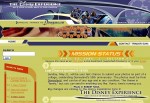
We’ll start with one of the more popular site designs: the Tomorrowland theme. It didn’t last very long due to how the color scheme made me feel seasick. There were also a few design features that didn’t work out as well as I had hoped.
With Disneyland’s 50th anniversary still going on strong, I switched to red-yellow-blue scheme that celebrated the park.
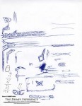
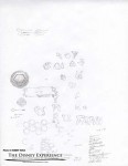
Here are two sketches fleshing out the overall design and the Flash-animated menu system. I even toyed with the idea of creating an alien alphabet.
Toying with the menu, I created a second, unpublished version. The new menu had a hidden menu. To reach it, guests would have to first access the security interface and enter an access code. Once there, guests could download a special . . . something.
For the first time, you can interact with the previously unpublished menu. Click on the image to load the Flash movie. In the middle of the orange menu buttons are four empty spaces. Clicking on these spaces will show/hide silver buttons. Play around with them to figure out the right combination that will bring up the security interface.
In the security interface, enter code ‘07.17.55’ to gain access.
One unique fact about this design: it had the most number of animated splash pages. Three in total, to be exact. This one was an attempt to represent the launch tunnel from Disneyland’s relaunched Space Mountain. One person even called me on my choice of music, which is a selected portion from the Buzz Lightyear’s Astro Blasters attraction. I chose it for its spacey, retro feel. Click the launch button to be jettisoned into a swirling quasar.
This one was an abstract design. It did have authentic Space Mountain sounds, though.
Again, the design was switched back to honor Space Mountain’s relaunch. Ships fly by, launch, and dock with the station.
One of the coolest and most favored by guests was the animated site header. I love the retro look, and the rockets shooting past gives it an air of kinetic excitement.



I think it was me who called you on the BLAB music Sam- but I did like that intro! Actually one thing that made me curious is where you got that sound effect at the beginning that plays in the ride as you’re entering the tunnel.
All this does make me nostaglic…actually speaking of Space Mountain, I still remember the splash animation from when I first visited the site. It was a small mouse pointer that clicked on the screen and created a pixel, and then started clicking faster and faster until it made the DE logo. And then as I recall the Space Mountain music played (the old Dick Dale music- the new Space Mountain had yet to open).
Oh, I remember that old Flash intro! I wonder of I still have it. Good recall!
I’m not completely sure where I got the sound effect for the SM tunnel. It’s been a while.
I found those animations (and more!). Boy, was that a blast from the past.
I’m glad you like it. There are lots of other things to see and discover. For example: at one time, I toyed with the idea of renaming the website to “Never” (as in Neverland). I forget what the tag line was, but it did make sense. There’s even a logo that I sketched out, but that’s as far as I went with it.
Love the new Art Corner. Looking forward to future updates.
Hiya!
Apparently I arrived here just a day or so after you launched the 50th version, so I missed the tomorrowland retro 70’s blue and green. It’s kinda funny though that those happen to be the colors they’re using in Vancouver right now. Maybe you have a fan at the i.o.c.!