Stained Glass Is a Pane

Okay, here’s an update on the Sleeping Beauty Castle paper model. It doesn’t belong with the Designing a Paper Model images, so it’s going here.
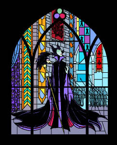
Before finally moving onto the adding of tabs and labels, I’m finishing up the stained glass windows. The real-life windows have a lot of detail. So much, in fact, that it would be insane to recreate it all. Since the printed windows will only be 2-3 inches high, a lot of that information (and work) would be lost. So, you may notice things like Maleficent’s missing face. Hopefully, no one will miss it.
Printing on Vellum
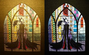
I’ve printed a test of this technique using vellum (I love vellum!). Two printed images were overlapped, and the colors really do become much more saturated. I clipped both a single print and a double-print to my desk lamp, and you can see a vast improvement. The photos to the left have not been retouched.
By the way, I got the idea/tip from Dave Lowe’s blog.
Both the post author and this website have not received any compensation for writing this post. Both the post author and this website have no material connection to the third-party brands, products, or services that have been mentioned. This is being disclosed in accordance with the Federal Trade Commission’s 16 CFR, Part 255: “Guides Concerning the Use of Endorsements and Testimonials in Advertising.”


Hi Sam,
I’m Still working on the Californian Castle Model and it’s coming on strong, unfortuly the paper that im jusing is not realy strong enough so i have to make the model stronger with other paper. But for the new model of the Sleeping Beauty Castle model i have all ready strong paper, i was wondering how the progress is going with that model?
I’m builing the model of the Californian model must larger than the orginal model and i’m going to do the same with the model of Euro Disney!
Keep up the good work!
Progress is slow and getting slower, but I’ll post about that later (hopefully soon). I’m about 75% finished with adding tabs and correcting a few mistakes. Then I’ll move on to numbering and labeling. This thing is going to break a personal record.
Hi Sam,
I’ve have a question about the Californian Castle model? i noticed that the richt door, behind the back of the castle is missing, in my files and on your site.
Can you tell me where that part is. Because i had downloaded all the files on my computer, and the castle is taking his shape. But if that part is missing i’ve had to change the model and that would be very dissapointing because than the model is not the same.
Which right door? There are two, and they are both in the files. This conversation is better suited as an email discussion.
That looks beautiful. Glad you found the tip useful. I actually got the idea from seeing modern movie posters with both sides printed for the light box displays outside theaters and in bus stops, etc.
There is some trial and error in printing the reverse image so it lines up right. I’ve done it often on past projects so I’ve gotten to know the little quirks to my printer and the adjustments needed. Yet, now you’ve got me slapping my head wondering why I’ve never just put two printed images together…so simple.
I never knew that about back-lit movie posters.
I’m strongly considering having internal lighting in my own model. I recently read a great tip on how to help keep the colors of the windows saturated. It involves printing the window images on both sides of the paper. Since aligning the mirror images perfectly is nearly impossible on any printer, layering two separate prints may work. Although, with two sheets of paper, the light will be dimmed. It’s a trade-off.
I printed my stained glass windows on transparency and backed them with tissue paper and another piece of tranparency. my tests with lighting provided very good results.
I print on vellum, which disperses light very nicely. Since I use a color laser printer, I don’t get the nice transparent colors that inkjets produce. I also don’t get that nice glossy look that makes the windows look more like glass.
The point of using multiple printings is to keep the colors from looking washed out from the light source. I got the idea from Dave Lowe’s blog.