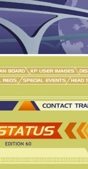
A Greater, Bigger, Beautiful Tomorrow

I’ve been chugging along on the new site design. At first, the whole thing was mostly green. Worse! It was sea green—I was beginning to get sea sick. But I’ve added some oranges, yellows, and blues, so it really looks nice. The animations are taking the longest even though they’re simple.
I’m constantly changing things, so the image above may not be an accurate representation by 2006. It’s very angular right now, taking inspiration from a hexagon, and I’ve just started going through my audio library for sounds to add into the site. Hopefully, I’ll have enough material that will enhance the design even more. If you have Flash, you’re in for a treat. If not, the site will look just as good. I’ve recently come across some nice scripts that will swap still images in place of Flash animations accordingly, so the site will please everyone.


Do you have a thought about this post? Why not leave a comment . . .