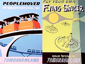
A Great Big Beautiful Tomorrow

As is my custom, I have begun (very) early work on the next design for the Disney Experience. I thought I’d do a more futuristic, angular design. So far, I only have the main menu designed, and it’s looking too cold and steril—not very Disneyesque. But I just got an idea that may help with that.
I’ve decided to base the site design on the old retro Tomorrowland attraction posters. They’ve got a nice, clean line that I’ve always enjoyed. The challenging part is trying to take that retro design and do my own take on it. I’ve never been successful in copying other art styles; my own style always works its own way in somehow. It will be interesting to see what I come up with.

Do you have a thought about this post? Why not leave a comment . . .